After 10 years of the now infamous ‘ribbon’ toolbar, Microsoft has decided it’s now time for a redesign of the interface for it’s office suite. Don’t panic though, for those of you who are dreading a major overhaul, such as the one we saw introduced with Office 2007 (if you are lucky enough to remember it!), you can always go back to the old view, if you don’t like the changes this time.
So what is changing?
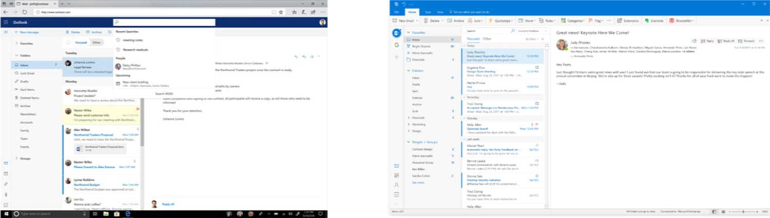
Well the ribbon has been simplified to be on two lines instead of the previous three, Microsoft feel this offers a cleaner experience to end users, which along with the new high contrast icons, will help increase the focus on work and collaboration. For those of us who remember Office in the pre-ribbon days, the screen shots of the new Word and Outlook interfaces below will look vaguely familiar.
Microsoft are very proud of the new icons. As well as the high contrast look, they are designed to render crisply on screens of any size and to harmonise the user experience across the Windows, Mac and Office online platforms.
Finally, the search function has been turbo charged. Office will now attempt to predict what you are searching for before you even start typing in the search box, known as ‘zero query search’. It sounds incredibly clever but it is designed to save time and frustration finding answers and content.
So when can you expect to see it?
The new icons are rolling out to Office 365 users as we speak. Some companies will start to see the option to preview the changes in Outlook as well – these are typically tech businesses such as Pro Drive who receive the insider builds ahead of general release (and yes, we have it now!). The web version of Outlook is also being updated but Word, Excel and PowerPoint will come along later, as Microsoft wants to ensure they have carefully planned the upgrade of these ‘workhorse’ applications.
Want to know more?
Speak to your Account Manager for more information or a demo or view this video posted by Microsoft.